Showing posts with label tutorial. Show all posts

Friday, April 8, 2016

Feet

Here are some points to note about the foot.

The inner ankle is placed higher than the outer ankle, which is also farther to the back.


The little toes curl down, the big toe may curl up a bit. 


The pads on the outer side tend to bulge out a little.


When drawing the underside of the foot it will look much better if you leave the sole open.


Usually only the pads touch the floor.


Different views


Well, that's it for now  
Don't let feet be your Achilles' heel ;)

Friday, March 25, 2016

Hands

Hands, drawing them gets easier with practice.
These are some points to remember when drawing hands.


  • The thumb reaches to the second joint of the index finger.
  • The pinky reaches to the third joint of the ring finger.
  • The thumb axis is placed at the palms' base.
  • The thumbnail does not face the same direction as the fingernails.


The palm side is concave. 

The back of the hand is slightly convex.
In a fist the fingers are pointing toward the middle.
The alignment of the finger-pads in relation to the knuckles. 

The best way to learn to draw hands is through practice and observation.
That being said I hope you found this post... handy :P


Thursday, March 10, 2016

Creating the Illusion of Depth


Depth is awesome! It makes a picture feel like a window to another world or something cool like that. Here are a few ways you can add depth to your paintings.

Perspective (no surprise here)
things appear smaller the farther they are and lines converging to a point on the horizon, are good ways to show perspective and convey a sense of space


Overlapping forms
It's not just the separate things that can overlap one another, but also the forms within a single thing


Lines that "describe"/follow the form
On figures it's usually the clothing


Shallow focus/Small depth of field
Choosing an area to focus on and blurring the rest.


Gradations
There are many reasons for gradation to happen in nature. Regardless the reason, It's rare for things to stay the same color and value all throughout.

Aerial perspective/Atmospheric perspective
With the increasing distance, objects fade into the background, lose contrast and details 


That's all for now
Take care!


Thursday, February 25, 2016

Using "Camera Position" For Mood

Continuing the composing for mood posts series... thingy from last week.
So, apart from light and shadows, we can use the "camera placement" to evoke or enhance a feeling in a picture.

To the examples!: 

Low angle 
Placing the eye level low, will make things appear big, powerful, imposing, in control, or important and looked up to 
 

High angle
Placing the eye level high will make things look small, weak or in distress 
 

Closeup
It's really good for showing facial expressions, it lets us see what a character feels or think. It's also useful for showing important details. 
 

P.O.V - Point Of  View
If closeup lets us see how the character feels, P.O.V, puts us in the character's shoes. This can be used for a lot of different purposes 


Tilted view (Dutch angle/tilt)
This is a fun one. Tilting the image, gives an unbalanced look, which really helps when you want to get a bit more action from your image, or to just create an uneasy feeling.


You should experiment with where you place the "camera", you may find something that works and unique, which will improve your composition.

I hope this post benefited you.

Next time other tools that can help us evoke a feeling in a painting.

Thursday, February 18, 2016

Light and Shadows


Mood, in my opinion is really important for a painting, especially if it meant to convey a story point. Light is a very important tool to use when creating compositions for your paintings. How you light your scene influences the mood of the image.

Low amount of light (low key),
usually is more sad, creepy or mysterious.


While high amount of light (high key),
tends to have more happy, calm mood.


We can use the shadows to add or omit information.
Here the shadow adds information we know there's a teddy bear in the room

Here the shadow hides the figure. 
To me it makes it seems creepy or mysterious because we can't see who it is 
 

Just to play with this idea, I painted in the figure and brighten the shadows.
Much less mysterious.

Soft diffused lights are better to show beauty and well... softness.


while hard lights tend to be more dramatic


There are other ways to use light to create mood, such as its direction - different angles create different effect and its sources - for instance candle light vs sun light


Yeah it's fairly obvious and simple, but it useful and it isn't that much discussed.
That's all for now. I hope you found this helpful or a least entertaining :)
Next time Using "Camera Position"  For Mood

Tuesday, September 29, 2015

Lips Tutorial


Just another small guidelines \ points thing :)


higher res: http://orig04.deviantart.net/7441/f/2015/267/9/0/lips_tut_by_scaringtimeaway-d9aqev4.jpg

http://scaringtimeaway.deviantart.com/art/Lips-Tut-562224064

Wednesday, March 4, 2015

Ear Tutorial

Just like in the nose tutorial - some guidelines and anatomy 
Hope this helps :)

Tuesday, July 1, 2014

Nose Tutorial


Some guidelines and anatomy 
Hope you'll find this helpful 


Monday, June 16, 2014

Color Examples

Continuing from last week here are a few examples:

Color contrast / complement


Saturated red against desaturated blues and greens by Howard Pyle


Oranges against blues by Maxfield Parrish 


Color behaves in context


Grays appear warmer then they actually are surrounded by cools by Mead Schaeffer


grays appear cooler they actually are against warms by 
Maxfield Parrish 
it's amazing how the grays looks like violets in  this context 


Sunday, June 8, 2014

A Pinch of Color Theory


The color wheel


Color behaves in context
Color will appear differently against another color. It can seem cooler or warmer, darker or brighter and
more  saturated or less then it actually is, depending on its surrounding


Color contrast / complement
Color contrast the most with the color which is the farthest in the color wheel
e.g  yellow & violet, blue & orange, red & green. etc


That's all for today I will expend on that in the following weeks
Have a good week

Sunday, June 1, 2014

Ten Things About Rainbows


·         The sun will always be behind the viewer
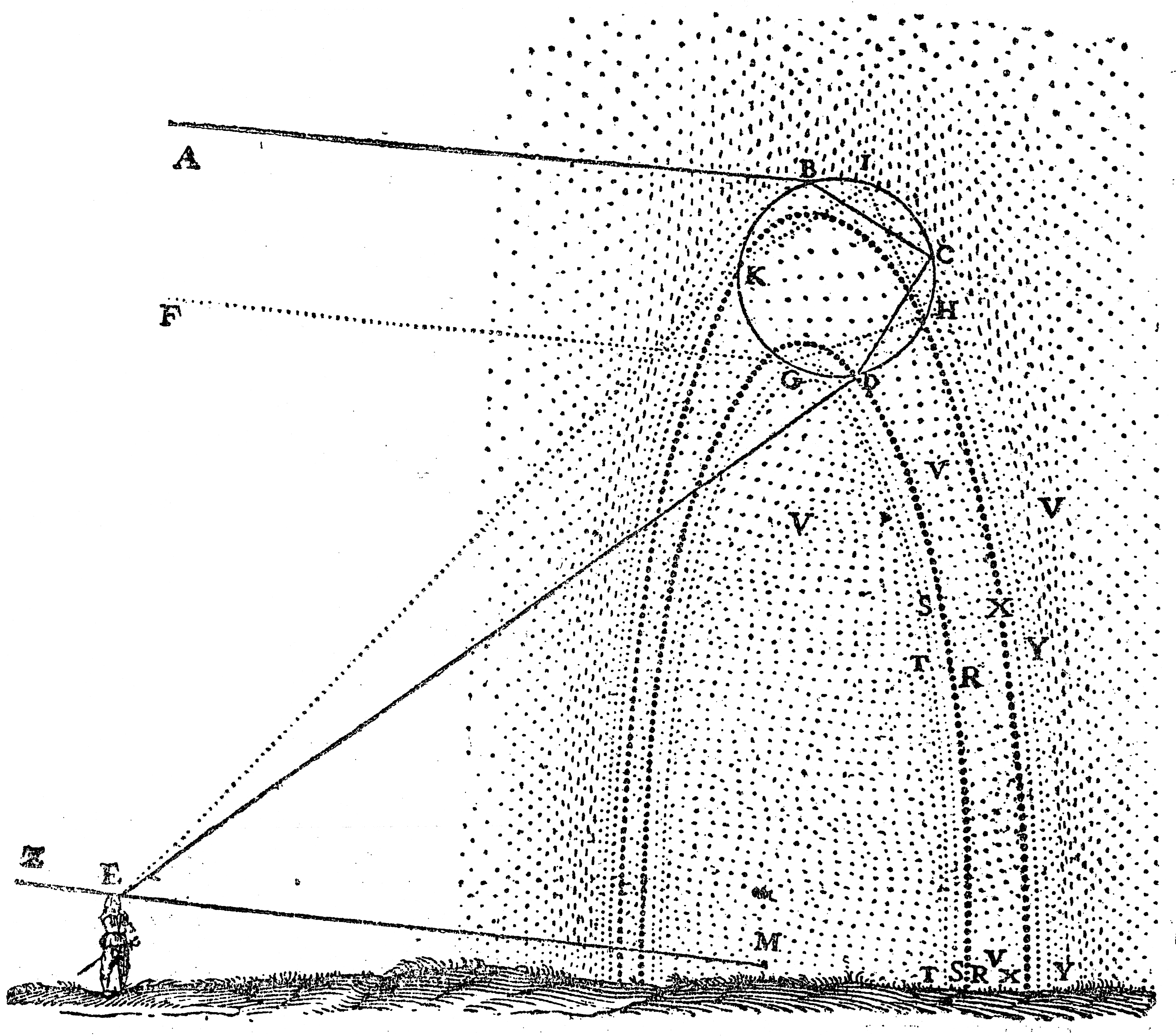
·         The rainbow will always start at about 42 degrees from the angle of the direction of the sun
File:Descartes Rainbow.png
·         The higher the sun the lower the rainbow and vice versa
·         Brighter inside the cone of the rainbow and darker on the outside of it
File:Rainbow in Budapest.jpg
·         The red on the outside and the blue/violet on the inside
·         On the secondary rainbow the colors are reversed – blue/violet on the outside and red on the inside
·          A dark bend is formed between secondary rainbow and primary rainbow (Alexander's band)
File:Spooky Rainbow.jpg
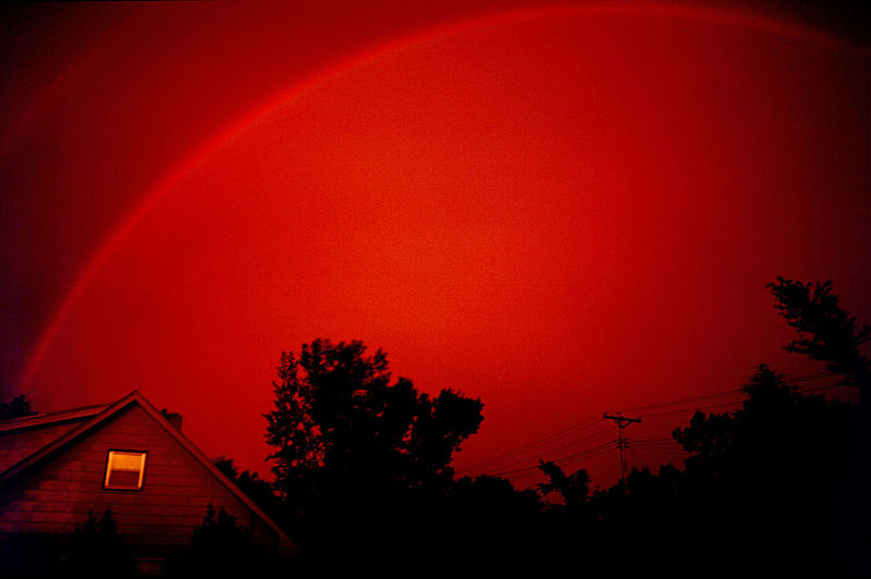
·         If the sun is at the horizon the rainbow may be red
File:Monochrome rainbow.jpg
·         The secondary rainbow will start at about 53 degrees – about ten degrees higher than the primary rainbow
·         The secondary rainbow is wider and fainter then the primary rainbow

Of course you do not have to follow those points but, I believe it's good to have those in mind.

------------------------
links :
two short videos about rainbows by    SciShow on YouTube : video 1 video 2